Welcome, Guest. Please login or register.

Username: Password:
Pages: [1]   Go Down

Author Topic: EQFA 2.0 - what has changed?  (Read 10124 times)

Foxeye

  • Calendar Judge
  • Tuftear
  • *****
  • Posts: 727
    • View Profile
    • Jungle Fire
EQFA 2.0 - what has changed?
« on: July 05, 2010, 03:57:58 PM »

Yah, we weren't making it up when we said we were working on a site revamp. :D  It's been a long time in the works, but we're letting the new site out of the barn. Quite a lot has changed under the hood as well as superficially, so please please post in this thread if you encounter what you think is a bug, or if you have questions.

Changes Brought to you by the EQFA Team

New art!
In addition to our mascot Splotch, the artistic elf, we now have Blot, the storyteller.  As well as little people in the distance. As our community grows, you'll see more and more little people appearing in the landscape. :)

New Webhost
That's right, no more shared hosting, my chickadees...we've got ourselves a webserver custom-configured by The Silent One.  It should be fast, flexible, and less error-prone. And best of all, if you find problems with the site, we now have the access necessary to do something about it!   Among those issues that have finally been addressed are:
  • Long descriptions should no longer give an error. :D
  • Memory limitations will no longer prevent images larger than 2500x2500 from being uploaded
  • SSL can be supported (coming soon!)

New Layout
The image view page was updated to get rid of the clutter and dead-space, and display your art in a more attractive manner.  The calendar archives, Recent Artwork pages, and member profile page's were similarly given a facelift. And speaking of...

New Profiles
When you click on someone's name, you will now be taken to a summary of their gallery, with some of their key "stats" from their old profile included. If you want to view the original profile, you can click the "Personal Info" link from the new profile page.

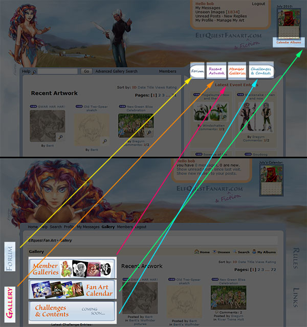
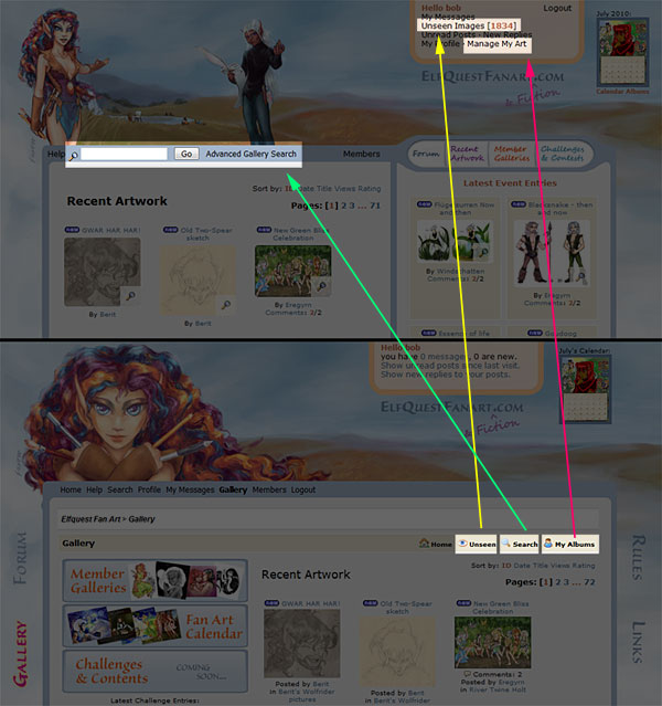
Streamlined Navigation
In an effort to make the site easier to navigate and to remove clutter, we have removed all of the links from the sides of the page, and concentrated what we thought were the key areas of interest into the blue bar. Additionally, all of the personal "control center" functionality (your messages, your profile, new art you haven't seen, etc) has been gathered into the floating golden box at the top-right of the page.

C/C Settings
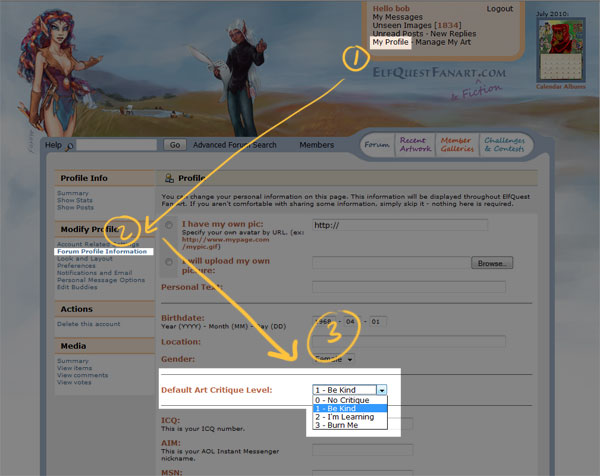
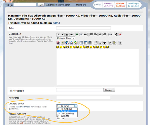
To encourage the giving of constructive feedback, we've added a c/c ("Comments & critique" or "Constructive Criticism") setting to images, as well as a default C/C level to your user settings. When you upload images, the c/c level defined in your account settings will be used as the default value, but you can raise or lower it on a per-image basis as you prefer.

Scroll down for some screenshot guides to using the c/c feature.


Changes Brought to you by the Gallery Mod Developers


  • New "preview" option for thumbnails (the little magnifying glass)
  • Ability to delete and move your own albums (yay!)
  • More robust permissions mechanism for albums
  • Ability to move/delete multiple images in an album.

Guide to Navigation Changes


Guide to C/C Feature

How to change your default c/c level (everyone is currently set to 1)

The drop-down list when adding/editing an image
« Last Edit: July 05, 2010, 07:53:36 PM by Foxeye »
Logged

Afke

  • Tuftear
  • ***
  • Posts: 355
  • spoonie
    • View Profile
    • my linktree
Re: EQFA 2.0 - what has changed?
« Reply #1 on: July 06, 2010, 01:34:14 PM »

Everything looks so neat. :o I think the changes are very good. I'm kinda missing the old Splotch picture in the header, but I like the idea of adding more figures as this place grows. :)

Obi-Rak Kaeliri

  • The Silent One
  • Treewee
  • *
  • Posts: 2
    • View Profile
    • Jungle Fire webcomic
Re: EQFA 2.0 - what has changed?
« Reply #2 on: July 06, 2010, 02:23:12 PM »

Good old Splotch staring at you :)

By the way, we are still tweaking the back-end of the site a bit, so things may be a little in flux for the next couple of days. Mostly hunting down any errand 500 errors that creep up.

Obi-Rak Kaeliri

  • The Silent One
  • Treewee
  • *
  • Posts: 2
    • View Profile
    • Jungle Fire webcomic
Re: EQFA 2.0 - what has changed?
« Reply #3 on: July 06, 2010, 10:39:50 PM »

SSL has been enabled :)

Eregyrn

  • Tuftear
  • ***
  • Posts: 224
    • View Profile
Re: EQFA 2.0 - what has changed?
« Reply #4 on: July 07, 2010, 07:19:41 AM »

I really like all of the changes!  It definitely all looks more streamlined. 

(The only thing giving me pause -- I swear, at first glance, it looks like Blot is giving us the finger...)
Logged

Foxeye

  • Calendar Judge
  • Tuftear
  • *****
  • Posts: 727
    • View Profile
    • Jungle Fire
Re: EQFA 2.0 - what has changed?
« Reply #5 on: July 07, 2010, 08:58:32 AM »

 :o

...and that would be why it's sometimes dangerous to work at a much higher resolution than the intended size!

mischievous_valkyrie

  • Wolf
  • **
  • Posts: 90
  • life is what you make of it
    • View Profile
Re: EQFA 2.0 - what has changed?
« Reply #6 on: July 07, 2010, 09:03:53 AM »

Woohooo! the new layout if Fantastic and I love the New picture of Splotch and her Counter part Blotch they are both Fantastic! I really like Splotch's outfit too
Logged
Claim Victory in your heart and the universe will follow

Eregyrn

  • Tuftear
  • ***
  • Posts: 224
    • View Profile
Re: EQFA 2.0 - what has changed?
« Reply #7 on: July 07, 2010, 09:23:24 AM »

Believe me -- when I actually look at the pic closely, I can totally tell what's going on with his hand!  But yeah... at the smaller size, at quick glance or out of the corner of my eye... that's what that shape mostly "says" to me.  :o
Logged

Foxeye

  • Calendar Judge
  • Tuftear
  • *****
  • Posts: 727
    • View Profile
    • Jungle Fire
Re: EQFA 2.0 - what has changed?
« Reply #8 on: July 07, 2010, 09:43:03 AM »

Oh, btw Eregyrn, I wanted to be sure you saw this part of my wall o' text up there:

Quote
Long descriptions should no longer give an error

Let me know if you still manage to get the old error, but I tested with a pretty huge chunk of text, and it managed it OK.  *happy dance*

Eregyrn

  • Tuftear
  • ***
  • Posts: 224
    • View Profile
Re: EQFA 2.0 - what has changed?
« Reply #9 on: July 07, 2010, 11:26:18 AM »

Yes, I noticed that. :)  I may try to test it by copying some of the description pieces that I had previously posted as comments back into the descriptions.  And I'll definitely keep an eye on it for the next time I post something.  (I guess I'm wordy.)
Logged

Obi-Rak Kaeliri

  • The Silent One
  • Treewee
  • *
  • Posts: 2
    • View Profile
    • Jungle Fire webcomic
Re: EQFA 2.0 - what has changed?
« Reply #10 on: July 07, 2010, 02:31:04 PM »

H'ok, a bunch of the bugs are getting squashed. Oi, the bugs we never knew existed to begin with. It is a good thing to have access to all of the logs finally. Running a site without proper logging is like driving in a blizzard with one eye closed...

Foxeye

  • Calendar Judge
  • Tuftear
  • *****
  • Posts: 727
    • View Profile
    • Jungle Fire
Re: EQFA 2.0 - what has changed?
« Reply #11 on: July 07, 2010, 07:41:41 PM »

Believe me -- when I actually look at the pic closely, I can totally tell what's going on with his hand!  But yeah... at the smaller size, at quick glance or out of the corner of my eye... that's what that shape mostly "says" to me.  :o

H'ok, updated it so it has a little less of that effect now. :oops

Treefox

  • Fan Calendar Participant
  • Tuftear
  • *
  • Posts: 1023
    • View Profile
Re: EQFA 2.0 - what has changed?
« Reply #12 on: July 08, 2010, 01:06:02 AM »

Even I'm not on here lately, I love the changes! I love the new header pic and the concept behind it! And Splotch's outfit is sooo gorgeous and fitting! Actually, I'm only not here, because I'm currently moving and my life is allover chaotic, but I definitely plan to be back soon!
Thank you for putting all this effort and time into the site!
Logged

Wildfire

  • Fan Calendar Participant
  • Tuftear
  • *
  • Posts: 371
    • View Profile
    • Instagram
Re: EQFA 2.0 - what has changed?
« Reply #13 on: July 10, 2010, 08:59:32 AM »

Wow, it looks gorgeous!
Logged

Eregyrn

  • Tuftear
  • ***
  • Posts: 224
    • View Profile
Re: EQFA 2.0 - what has changed?
« Reply #14 on: July 11, 2010, 07:13:38 AM »

H'ok, updated it so it has a little less of that effect now. :oops

I think that does help a bit. :)
Logged

Obi-Rak Kaeliri

  • The Silent One
  • Treewee
  • *
  • Posts: 2
    • View Profile
    • Jungle Fire webcomic
Re: EQFA 2.0 - what has changed?
« Reply #15 on: July 13, 2010, 01:02:15 PM »

There. I think we've worked out most of the kinks. A few extra server-side security features have been enabled now that the site's otherwise stable. Of course if you do encounter some issues, be sure to let us know.

We have also disabled site-wide SSL and only apply SSL for your username and password on the login form. This change was made in the interest of making embedded images from places like flickr, photobucket, or whathaveyou, not trigger a security alert for the unsuspecting user. Server performance was not an issue. Since this is a public website anyway, we just narrowed the scope where the security is applied. We figured it's a reasonable security tradeoff in the interest of user experience :)

Joyrider1978

  • Zwoot
  • *
  • Posts: 48
    • View Profile
Re: EQFA 2.0 - what has changed?
« Reply #16 on: July 29, 2010, 06:16:31 PM »

A super-belated WOWZERS and SUPERCOOL for the sweet new site!  Thanks, Fearless Leaders!  ;D
Logged
Pages: [1]   Go Up